

Which colours reminds you about a place you love? Is it one special colour, or is it many? And why do you love that place?
If you put together the answers to those questions, you will probably have a favourite colour palette.
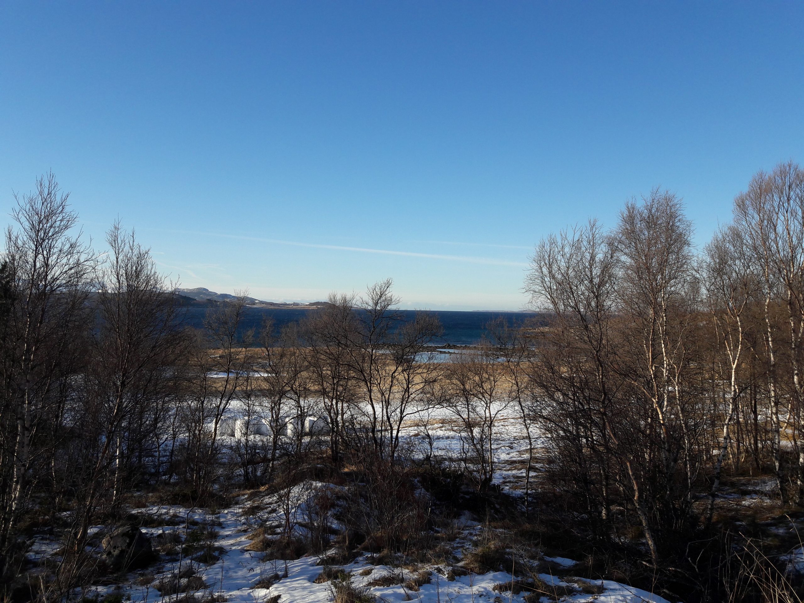
The palette for the sweater Hjemover contains some of the colours in the winter landscape a place in the northern part of Norway, where Aud B grew up. A place she loves. The English word for Hjemover is homewards.
To put the colours you love, together in a sweater
In the sweater Hjemover, the white represents the snow. White is used as the main colour because it is easy to combine with other colours.
The contrast colours are alternating, but the grey and the green are more used than the other colours. They are both calm colours, which helps to stabilize the expression, and reminds about the winter green trees in north, and the stones.
The sky in north changes a lot from day to day and all day through. Sometimes the brightest blue, and sometimes greyer. The sun is low in the winter and paints the sky in all kinds of pastel colours, especially in frosty weather. The yellow is an example of that.

To see more designs from Aud B, visit the online shop at audb.no. And for more inspiration, stay tuned to this blog and check it out.